Notes and Thoughts on Edward Tufte one-day seminar
Dr. Edward Tufte is doing his one-day seminar tour. I sent two of my team to attend on the first day in Austin, and I went on the second day in Houston. If that doesn’t send the message that I think this is a very worthwhile and valuable seminar, then let me be clearer: Dr. Tufte has been and remains the expert in data visualization and he not only keeps up with developments in this area, he explores it and expands it by doing his own developments.
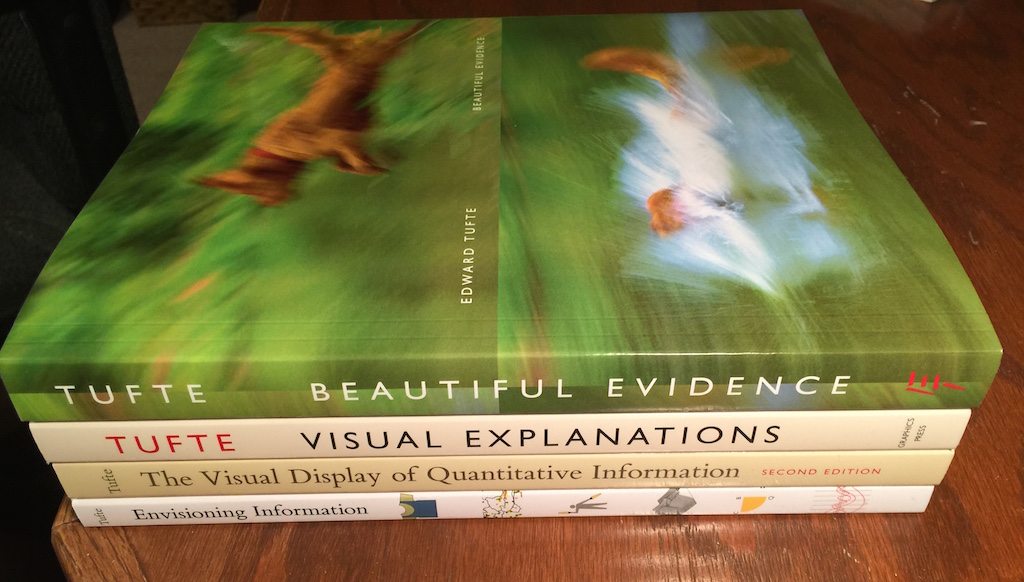
The fee was $380, and includes all four of Dr. Tufte’s books, which cost $100 by themselves. I was not aware that these four gorgeous books were self-published by his own Graphics Press; gives my JoSara MeDia something to aspire to.
And I got all four of his books signed, so the geek fan boy in me is quite happy.
There was no set delineation of the presentation, though in typical Tufte fashion there were handouts and suggested reading during the “study hall” period. I got there early, sat on the front row and had Dr. Tufte come down the row, introduce himself and ask what I did while signing the books. We talked a bit about medical records, EPIC (a large EMR company) and how faxes still dominate the medical field.
Besides geeking out with Dr. Tufte, what did I get out of it?
- As always, adopted some suggestions for many of our apps, including thinking about the Media Sourcery workflow app as a box score (which it kind of already resembles) and taking my Grand Canyon map experiments into a video panning phase (which I tried once, but looks like the tools have improved).
- Too often we hear our customers ask us to “dumb it down for the users.” Edward Tufte continually reinforces the opposite of this, that users can handle the complexities, as he goes through his examples.
- And, of course, his fundamental principles of analytical design (I listed seven, his book BEAUTIFUL DESIGN lists six…so maybe I created one!)
- The “Tufte-isms” were great, thrown out frequently…so frequently I’m not sure I captured all of them. Quotes from Dr. Edward Tufte are marked like this.
The outline below is my own, just to arrange my notes. They are here for my bad memory, and for your consumption.
Introduction
 Like most of the world, Dr. Tufte is not a fan of Powerpoint. And the readings assigned in the study hall (more on study hall later) remind of a few of his standard recommendations:
- Simplification is not the answer, users can handle complexity
- “Clutter and confusion are failures of design, not attributes of information” (Envisioning Information, pg. 50)
Study hall had several assigned readings in the one hour time set aside, which Dr. Tufte roamed around, signing and talking. Also in the agenda is a set of “Special Interest Topics” (ten sections of these) and two selections of “Homework”. Wonder if I should set deadlines for my guys to get this done… :)
Information Examples
Dr. Tufte went through multiple examples of “information as the interface.” From the seminar page on his website:
“Fundamental design strategies for all information
displays: sentences, tables, diagrams, maps, charts,
images, video, data visualizations, and randomized
displays for making graphical statistical inferences.”
Example #1 – Stephen Malinowski’s Music Animation Machine (try it out at the link)
 Example #2 – National Weather Service (the base site is linked to, but the site reviewed was a specific forecast, enter a zip code to see the particular page)
mentions little data, with no more little data graphics…which doesn’t force viewers to have to figure out graphs.
Everyone knows how to use, read and view numbers, words and simple graphics.
Tufte: “Minimize design-figuring-out-time, Maximize content reasoning time”
A lot of data on one scrollable page. “Humans are good at scanning and recognizing what they are looking for” (example: finding your name on a long list of names)
Tufte: “Being read to from a Powerpoint, the rate of information transfer asymptotically approaches zero.” This guy is witty, eh?
Tufte: “Only two industries call their customers users: illegal drugs and software.” OUCH!
1st: view/eye, 2nd: scroll, 3rd: drill down
Example #3: Policy Story from the NY Times (old article, can’t find online)
Logo and author links show responsibility, accountability, credibility
There are 60 numbers in the story, no graphics, reinforcing the earlier point about that everyone knows how to use/read/view numbers and words…no need to get fancy.
Tufte: “Use experts to get the presentation/article out of your voice and into the experts voice.”
The graph in this article is terrible, sourced from a lobbyist group, with no defensible numbers.
Example #4: Health Article from NY Times (again, an old article). Dr. Tufte does like the NYTimes website, and uses them frequently in examples.
Main point here is a graph of charges vs. Medicare reimbursement. The graphic uses annotations on the graphic, which helps the reader to immediately know how to read the display.
Dr. Tufte continually emphasizing comparing corporate IT properties to Google News, Google Maps, NY Times and WSJ. “Put your IT material next to these. Aim high.”
 Example #5: ESPN.Com World Series page
Using the box score, one level down from the home page. An example of numbers and words, a table of lots of numbers, that is viewed all season for every game and has been for a decade. Great example….though the example he showed didn’t have the cool underwear ad that mine captured! Score!
Tufte makes a point about ordering by interest or mathematical order, not alphabetically.
He ends this segment with my favorite quote: “No matter how beautiful your interface is, it would be better if there is less of it!”
Edward Tufte on how to give a presentation
From the seminar page on his website:
“A new, widely-adopted method for presentations:
meetings are smarter, more effective, 20% shorter.”
- Begin with a document – Paper has the highest resolution of any current medium
- Every meeting should begin with a study hall – don’t make a big deal about it. Give attendees your document at the beginning of the meeting and ask them to read it. No one reads material passed out before a meeting. Use meeting time for the content.
- Don’t touch every point in the document. Annotate.
- Take questions. Take notes on the questions. Directly answer the questions.
- Example: take a document with your symptoms and questions in to your doctor.
Dr. Tufte shows an Amazon article where they have no powerpoint, all meetings start with a 30 minute study hall. Quote on the article (not sure who to attribute): “Powerpoint is easy for the presenter, hard for the audience.”
Information Architecture
From the seminar page of his website:
“Standards of comparison for workaday and for cutting
edge visualizations. How to identify excellent
information architectures and use them as models and
comparison sets for your own work and for the work
of your contractors. Monitoring the designs of others.”
This section was a bit of a jumble, with various topics, but some excellent examples.
Covered scientific publishing, discussing how jargon is reduced as articles go from the back of Nature to the front of Nature to the more populist web sites and publications. Most people only read the abstracts (so true), and the abstract should state (like a thesis) problem-relevance-solution.
After a break, Dr. Tufte once again mentioned the woefulness that is government and corporate IT Dashboards. He referenced again the ESPN.COM box score page as a easily readable dashboard with tons of numbers as a “standard for comparison.”
The point of an information display – “To help thinking about the content”
Example #1: NYTime Article with Annotated Linking
Tufte notes that NYTimes employs 40 “Graphics News Reporters.” Do not use plain un-descriptive lines, use annotations on lines. Also goes through a diagram on pg. 78 of BEAUTIFUL EVIDENCE which uses annotated lines in a diagram tracking SARS patients.
Example #2: Tim Berners-Lee, his original paper suggesting the Internet and linking
Tufte showed the manager’s comment that he originally put on top of Berners-Lee’s paper “Vague but exciting…”. And a good quote from the document, a hierarchy of nouns to the flatness of verbs.
Example #3: xkcd – over lap of items on the front page of college website on left side intersecting with items you really want to know…with only the college’s name in the intersection.
Example #4: Google Maps – again, enforces compare this with your workaday presentations, since everyone uses and knows how to use this seemingly complex app. Compare diagrams to Google Maps. Satellite view – overlay data on top of them.
Example #5: Popular Music chart (from pg. 90-91 of VISUAL EXPLANATION). I found a similar one online, it is shown to the right. It is a flat interface, Tufte showed an iPad version of it in a video and on screen which had the artists names clickable, playing their music with videos behind the diagram. Very cool.
Then he showed the Viz-A-Matic….a graph generate that showed what NOT to do.
Edward Tufte on Being a Spectator (consuming a presentation)
From the seminar page:
New ideas on spectatorship, consuming reports.
How to assess the credibility of a presentation
and its presenter, how to detect cherry-picking,
how to reason about alternative explanations.
Tufte: “A presentation or graphic should provide reason to believe.”
Tufte: “An open mind but not an empty head.”
Two things in presentations as a spectator – Content and Credibility
Watch out for Cherry Picking (which is not when a Houston Rocket stays back toward his basket waiting for a long pass) – picking only certain details to support points. Also, not linking to the source documents, and being in a “rage to conclude“.
Tufte: “Why go to a presentation whose conclusion you agree with?”
Measurements that are in presentations – have a sense of what is relative. See how the measurements are actually made; get out into the field. See directly. The fog of data will fall from your eyes. Tufte mentions when a chemical company was policing themselves, collecting water samples in clear water…”sampling to please.” People and institutions cannot keep their own score.
Search Google Images for data, the search results are not gamed like the normal Google text searches are.
Finale – Maps moving and Fundamentals
A little bit of talk about displays, and a demo of movie panning over very nice maps of the Swiss Alps. This is something I’ve tried to do with the Grand Canyon app, and I’ll try again.
Dr. Edward Tufte also talked about Small Multiples and Sparklines briefly, but these are covered in detail in his books.
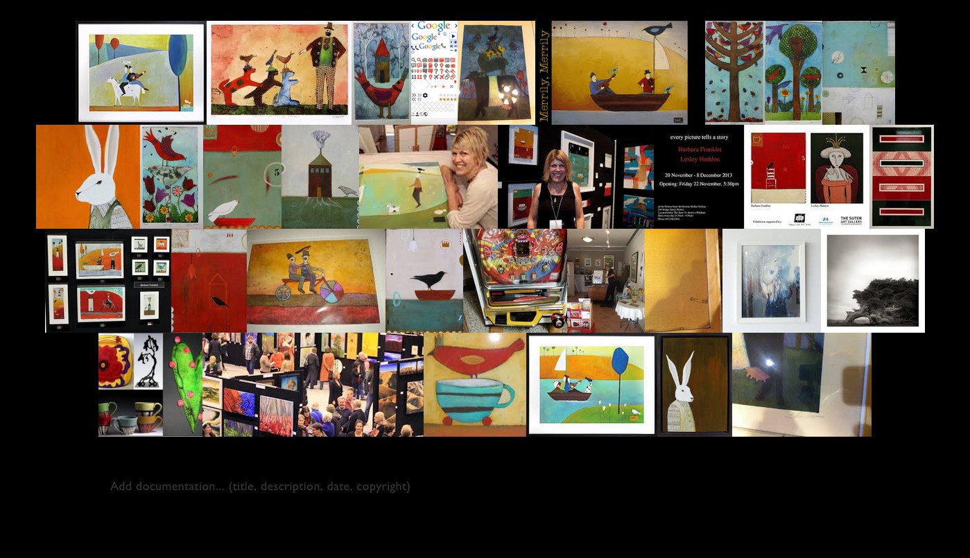
Dr. Tufte demonstrated a tool called “Image Quilts” by Adam Schwarz. It is a chrome plug-in/extension. I played with it, using my friend and artist Barbara Franklet’s images through a google image search.
He closed with his Fundamentals. As stated in the beginning, there are six in the book, but I counted seven.
- Show Causality
- Make Comparisons
- Displays Should be Multi-variate
- Integrate All Modes of Information (text, numbers, images, videos, everything)
- Document (i.e., show sources)
- It’s all about content
- Displays are flat, but the world is not
Tufte: “move to web-based presentations. move away from flatland.”
I cannot recommend this seminar and these books highly enough.


